I'm building a clothing brand for people who used to compete and never stopped thinking like an athlete. This form shows you the designs and asks what you think. That's the whole thing.
None of this is made yet — it's all concept art, and all of it can still change. That's exactly why your answers are worth something right now.
How it works
1
Answer the question on each screen.Tap your choice. Starred questions are the ones I really need.
2
Tap any picture to open it full screen and look closely.Zoom in, then tap the exact spot you like or don't like — mark it good or bad and say why. Tap a dot to edit or delete it. The most useful thing you can give me — and completely optional.
3
Hit Next at the bottom, and Send it at the end.Your answers come straight to me. No account, no app, nothing installed — just your name and email so I know whose feedback is whose. I may email you once when there’s something to show, and that’s it.
Please be blunt. I don't need encouragement, I need information. If something looks cheap, corny, or like every other gym brand — say that. A friend who tells me the truth here saves me thousands of dollars.
Four screens of questions and you're done. There's an optional second half afterward if you're enjoying yourself — you'll get the choice.
Before you see anything
Two quick ones
I'm asking these before showing you a single design, on purpose — once you've seen the artwork you can't un-see it.
Did you ever play a sport seriously? *
Changes how I read everything else you say.
College, semi-pro, or pro
Through high school
Club or rec, but competitively
Casually, for fun
Not really my thing
The brand is called Ex-Athlete Athlete Club. Reaction? *
First instinct. Don't overthink it.
Got it instantly — and I like it
Got it instantly — it's fine
Took me a second, then it clicked
Still confuses me
I understand it. I don't like it.
Decision one
The mark, and the kit around it
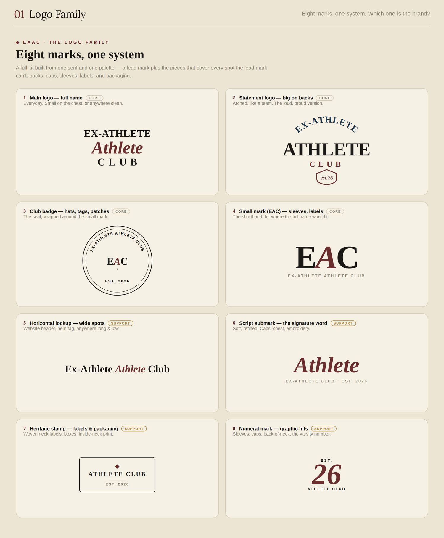
First the whole system — eight marks off one typeface and one palette, so there's a right mark for a chest, a back, a cap, a label. Tap it and look, but there's no question on this one.
tap to view & comment
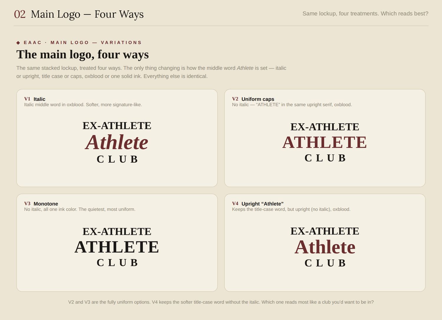
Now the main logo, four ways. The only thing changing is the middle word. This is the single decision that affects everything else, so take your time here.
tap to view & comment
Which one should be the logo? *
Pick the one you'd want on your own chest.
V1 — italic Athlete, oxblood
V2 — ATHLETE in caps, oxblood
V3 — all one ink color
V4 — upright Athlete, oxblood
Cut it to three
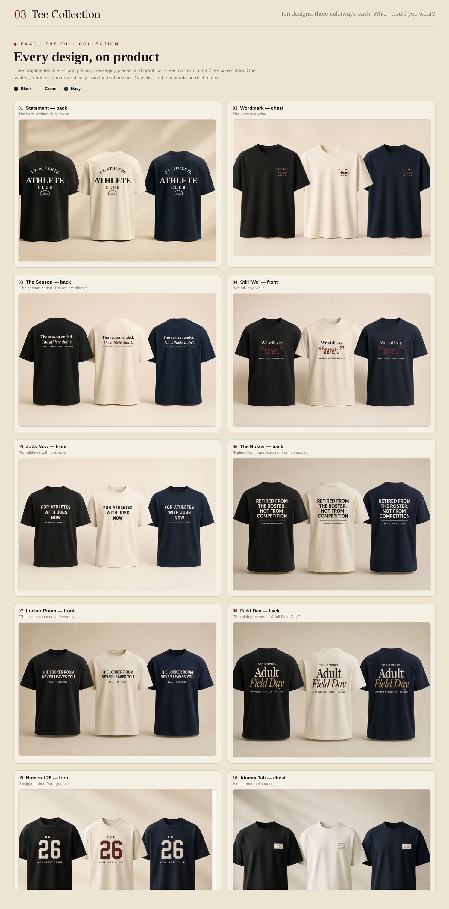
Ten designs
Tap the image to open it full screen — zoom in and go tee by tee.
tap to view & comment
Which would you actually wear? *
Pick up to three. Not "which is nice" — which would you put on.
01 · Statement — back
02 · Wordmark — chest
03 · The Season — back
04 · Still "We" — front
05 · Jobs Now — front
06 · The Roster — back
07 · Locker Room — front
08 · Field Day — back
09 · Numeral 26 — front
10 · Alumni Tab — chest
Honestly — none of them
Last required screen
The questions that actually cost me money
You see one of these tees in a store — heavyweight cotton, boxy fit. What does the tag say? *
What you'd expect — not what you'd hope.
Under $30
$30–40
$40–55
$55–70
Over $70
Real answer — would you buy something? *
Nobody's holding you to it. I just need the truth.
Yes — I'd buy at launch
Maybe, if it were the right piece
No, but I'd follow the brand
No
What's the weakest thing you've seen so far? *
This is the one I'll actually act on. Name a specific piece if you can.
Optional from here
That's everything I needed
Send it now and you've already helped more than you think. But there's a second half — hats, sweats, the lookbook, the website — if you've got another two minutes in you.
Bonus round
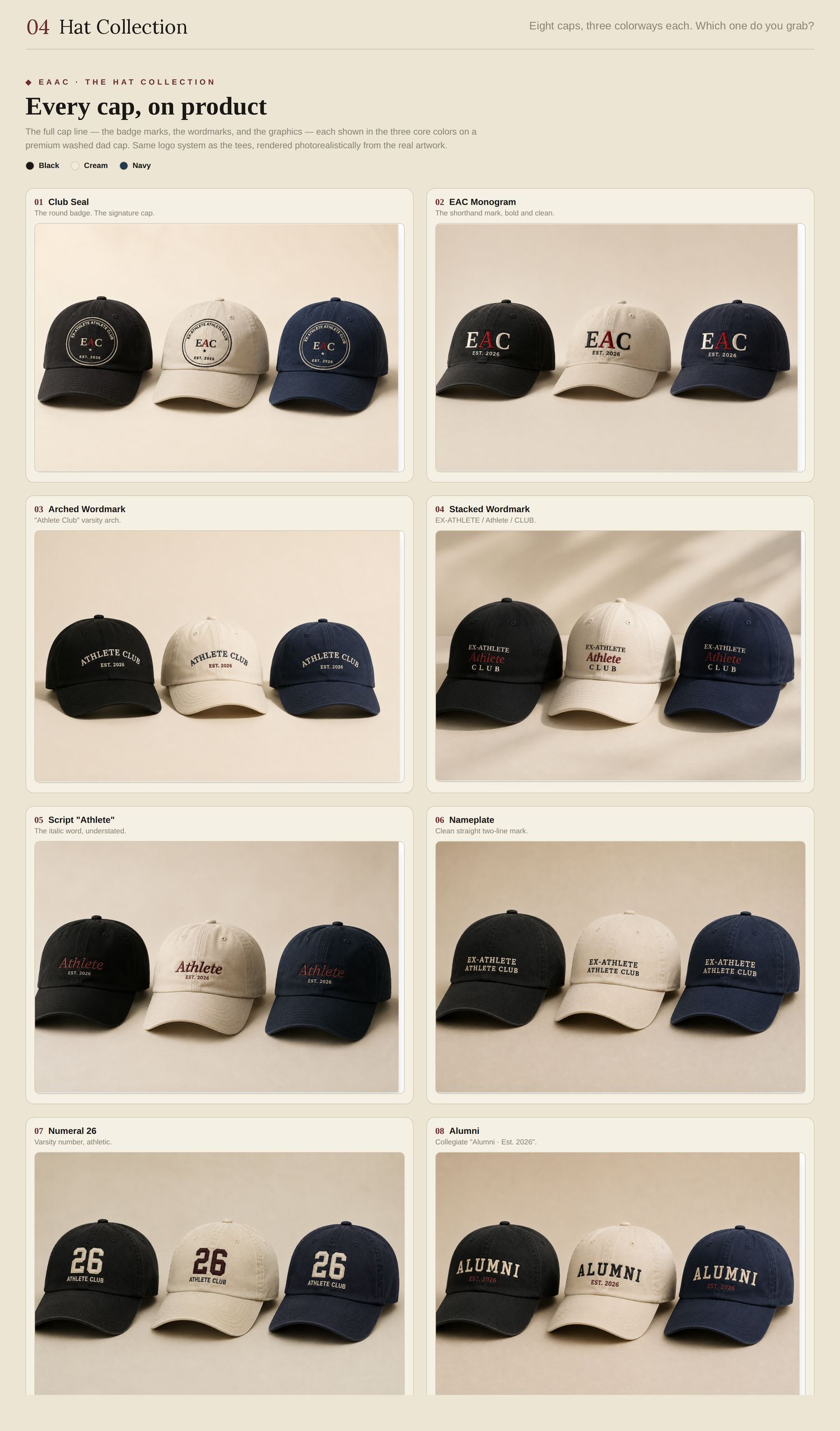
Eight caps
tap to view & comment
Which one do you grab?
One only.
01 · Club Seal
02 · EAC Monogram
03 · Arched Wordmark
04 · Stacked Wordmark
05 · Script "Athlete"
06 · Nameplate
07 · Numeral 26
08 · Alumni
None of them
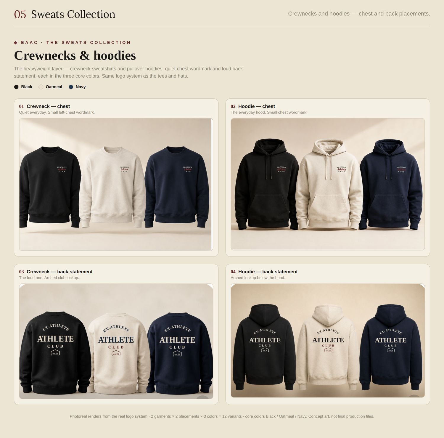
Crews & hoodies
Quiet or loud?
tap to view & comment
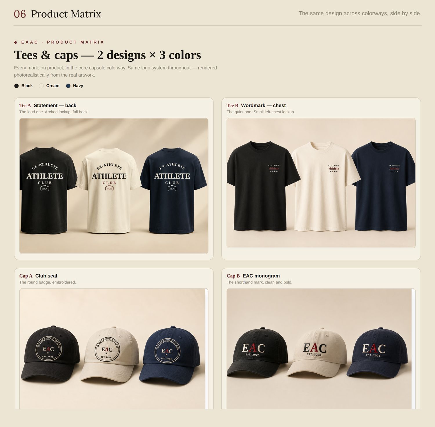
And the same two ideas on tees and caps, so you can judge the colors across the whole line.
tap to view & comment
Small logo on the chest, or big statement on the back?
The quiet chest logo
The big back statement
Both — depends on the day
Neither works for me
Best color?
The one you'd buy first. (Oatmeal is the light neutral — a few boards still print it as cream. Same color.)
Black
Oatmeal
Navy
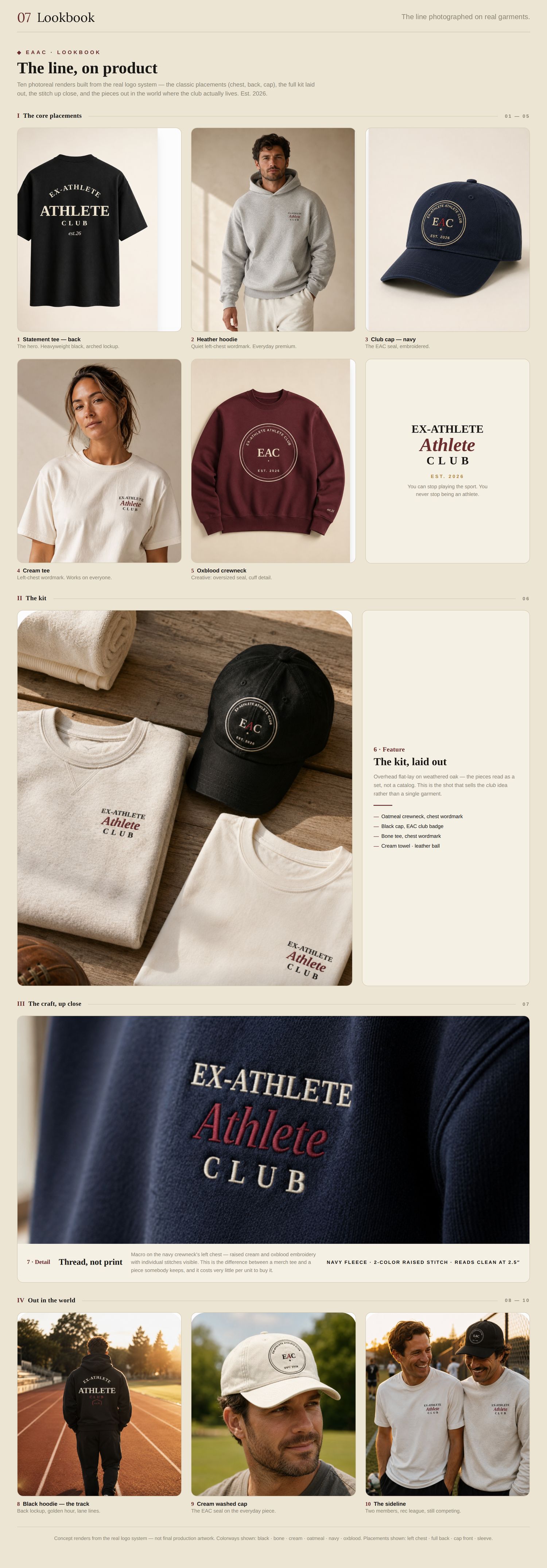
The lookbook
How it actually looks
tap to view & comment
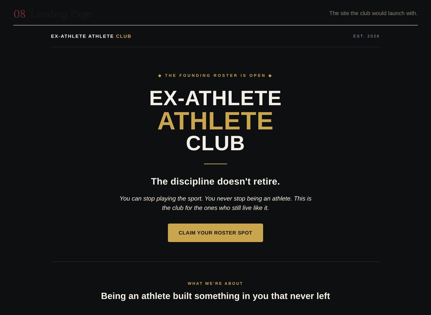
And the site it would launch with.
tap to view & comment
If you came across this on Instagram, what would you assume?
An established brand I hadn't heard of
Small, new, but real
Somebody's side project
One of those print-on-demand shops
The contact sheet
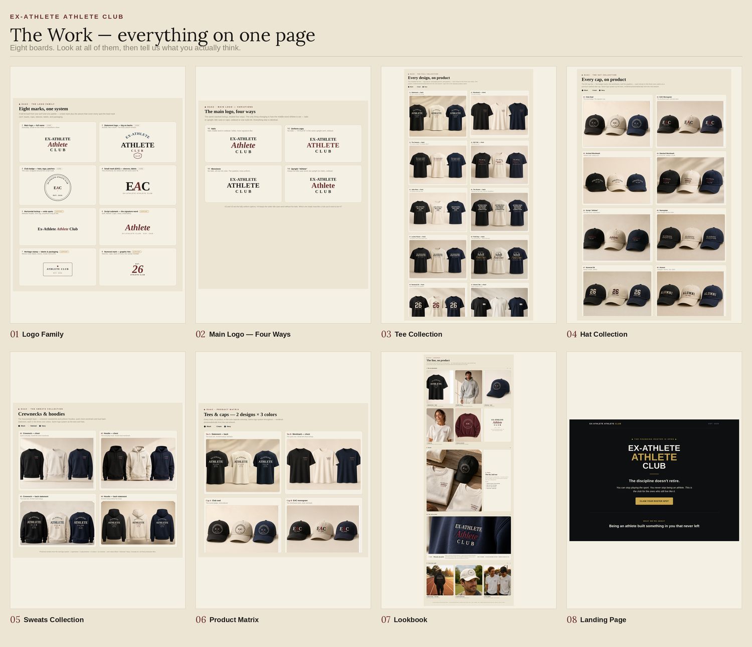
The whole thing on one page
Now that you've seen the pieces, here they are together. Tap anywhere that stands out — good or bad.
tap to view & comment
Anything I didn't ask about?
Optional. Ideas, a brand it reminds you of, something missing.
Done
That's it. Thank you.
Who are you?
Optional. First name is plenty — it just helps me follow up.
Want first access when it launches?
Optional. No newsletter — one message when there's something real.
Hit send below and your answers go straight to me.
Couldn't confirm that went through — so rather than pretend, here's everything you said. Copy it and text or email it to me. It all counts.
Got it. Seriously — thank you. This is the part most people skip.
You can close this page now.
Board
Tap any spot to leave a note on it. Tap a dot to edit.